
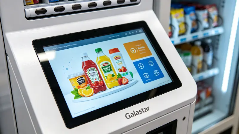
Removing the Confusion of Old-School Selection Systems
Traditional vending layouts that require typing in code combinations on a separate plastic keypad often lead to missteps, missed item codes, and abandoned purchases. Today’s consumers expect the same smooth, visual responsiveness they experience on their personal smartphones. To deliver on this expectation, Galastar has replaced old-fashioned buttons with large, high-definition glass touchscreens. This change updates the look of the machine and provides a clear, highly visual purchasing path that builds immediate confidence for the consumer.
The Design of the Galastar Touch Interface
High-Resolution Visual Item Inspection: Customers can tap on individual product blocks to open crisp image carousels, letting them view different angles of an item or read ingredient details before spending money.
Streamlined Digital Checkout Steps: The user interface guides players through a fast, three-step journey—select product, tap payment sensor, retrieve item—keeping transaction times down to a few seconds to prevent queue lines from forming on busy walkways.
Dynamic Visual Standby Promotions: When the machine is resting between purchases, the display switches into a full-bleed digital billboard that runs smooth video advertisements or high-contrast product loops to draw passing foot traffic from across the room.
Advance Your Operational Precision
Previous Step: Recessed Machine Integration: Aligning Smart Hardware Flush with Luxury Mall Interiors
Return to Hub: The Galastar Automated Retail Integration Strategy: Expanding High-End Smart Vending Across Premium Commercial Real Estate
- The Modern Evolution of Pinball: 2026 Guide to High-ROI Pinball Vending
 English
 Español
 简体中文
简体中文